|
Can you trust what you see on screen? When it comes to the colour of something it’s really difficult to get accurate representation of real world colours onto a screen. Take a look at an image on a website on different screens – PC, laptop, tablet, phone – each one will display a slightly different colour version. So you can imagine that it’s a huge challenge to convince art buyers that the image they’re seeing on their screen is a good representation of the work they are buying. Obviously it would be ideal to see the artwork in real life before purchase, but that’s often impractical. So as an artist, my aim is to get good quality images so that the photographs are an accurate depiction of my work. I try to take good quality photographs at home. To reduce glare as much as possible I find somewhere with northern light on a bright but overcast day and set up the artwork flat against a white/light coloured wall (blu-tack comes in handy to hold it flat), then set my camera up on a tripod so that the lens is at the same height as the centre of the painting. My camera is a Panasonic Lumix DMC-TZ70 Compact Digital camera. I change the settings to make sure that it’s on the highest number of pixels (12mb), no flash, lens aperture to f/5.6, ISO 80 (to allow maximum light), minimal zoom and then set it to take on self timer for 10 seconds so that there’s no shake. Try to get the painting in the centre of the viewfinder with the edges as straight as possible ( i.e. not fisheye). Take one, take two, take three. Then use a photo editing package to crop it neatly and adjust any colours or greyscale balance using the painting to check against – it’s not perfect but it works for most screen images – I wouldn’t make a print from it though! Once I have a good quality image I can downsize it without losing too much of the colour and detail for use on the web What about getting prints made? If I am having prints made of my paintings the best way to ensure accuracy of colour is to have them professionally photographed using studio lighting and colour calibration. This method also means that the ‘feel’ of the painting, in terms of texture of the paint and canvas or board, is retained. Simon Nottage at Bollington Print has captured all my paintings for prints and you can see the level of detail he has achieved in this image enlargement. The original painting is West over Eddisbury Hill, acrylic on canvas 500 x 400mm. 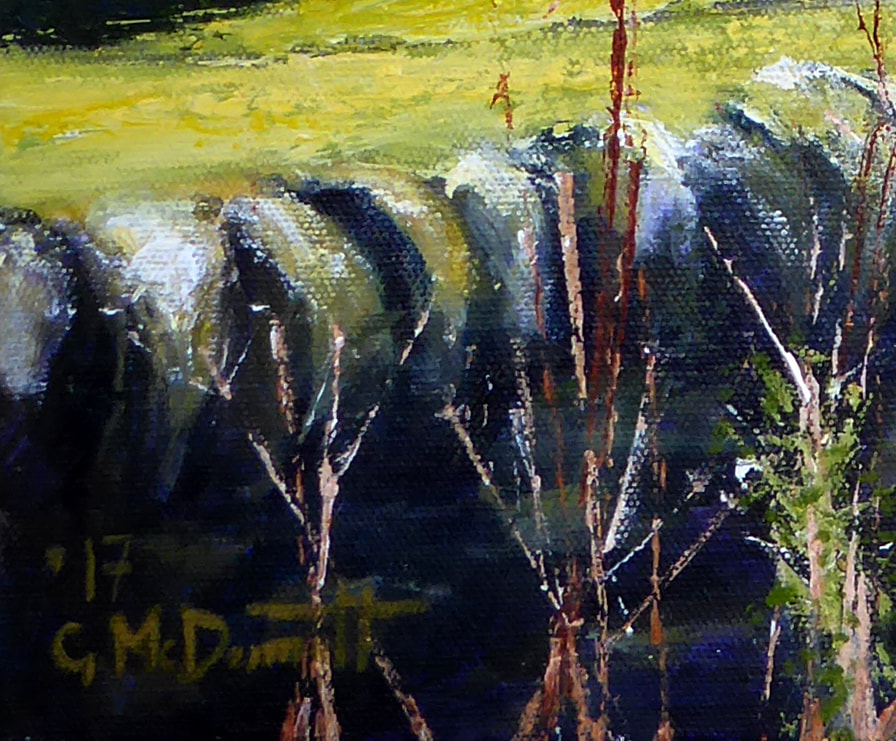 Having accurate colour calibrated monitors also means that I can check the on screen image against my original and ask Simon to make any slight colour adjustments if I don’t think they are 100% correct.
Remember: “It’s much better to photograph the painting before it has been varnished, to avoid too much glare from the lights,” advises Simon, “and definitely before it has been framed!” Interested to hear any tips on getting your paintings into digital format. |
Author“Would I give this wall space in my house?” is the question I ask of all my work. If the answer is ‘yes', then by law of averages someone, somewhere will also appreciate it, and the thing or scene it depicts. My paintings have to be of something or somewhere recognisable and my task is to capture and communicate the essential elements, whether that be colour, form, fragility, size, texture etc. There’s usually an element of fear in not being able to achieve this, which keeps me out of my comfort zone. ArchivesCategories |
 RSS Feed